
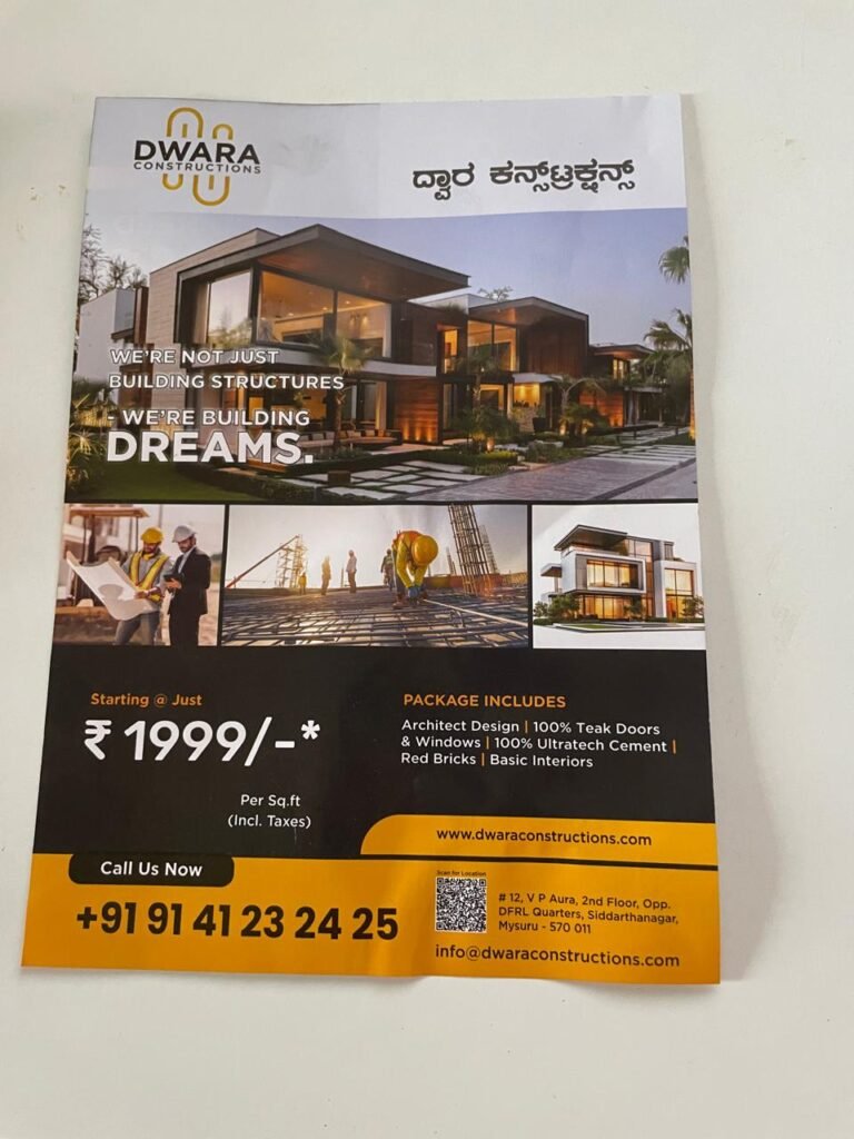
Recently, I found a flyer in my local newspaper. It was from Dwara Construction, a local builder with a new website. The flyer proudly displayed their web address: dwaraconstructions.com. Being someone who pays attention to these things, I visited to see what modern construction companies are building online.
I visited the website…
First impression? Visually impressive.
The homepage had a clean, minimalist design with professional typography. A large serif headline read: “Your Home, Built Once. Built Right.” Below that, their tagline: “One team for architecture, construction, and interiors — no handoffs, no finger-pointing.”
The design felt expensive and professional. A clear golden button invited me to “Get a Free Consultation,” and their phone number was prominently displayed. They even had floating chat and WhatsApp buttons on the side.
So far, so good.
Second impression? The browser froze.
Here’s what happened: As soon as I tried to scroll down to see their project portfolio, the page became unresponsive. The browser renderer literally crashed. The decorative animated background lines—subtle diagonal elements designed to look sophisticated—were part of a complex animation system that couldn’t handle basic scrolling.
The parallax effects and continuous CSS animations were consuming so much processing power that the page stopped responding. I had to reload the browser. This wasn’t a glitch. This was a design that looks good in screenshots but fails in actual use.
The Problem: Mistaking Showiness for Usefulness
This is not a critique of Dwara Construction specifically. They’re one of hundreds—thousands—of small business websites falling into the same trap. They’ve confused aesthetics with functionality, and in the process, they’re sabotaging their own growth.
Here’s the fundamental issue: most small business websites are built by designers, not by strategists. A designer’s job is to make things look good and appease the owner. He never cares whether website loads for a person browsing from remote areas like Koorgally, Vijayanagar 4th stage or Elawala Hobli.
A business owner’s job is to generate leads, close deals, and grow revenue. These two goals are increasingly at odds.
The Real Problems with Dwara Construction’s Approach:
- Browser freezes on scroll — The decorative animated background lines and parallax effects are so poorly optimized that basic scrolling makes the browser unresponsive. The page requires so much rendering power that it becomes unusable.
- Unoptimized animations — Multiple animation systems (likely CSS animations, JavaScript-driven effects, and parallax libraries) are running simultaneously without GPU acceleration or performance optimization. This creates constant redraws and janky scrolling.
- Complex DOM structure — The background decorative elements suggest an over-engineered approach to what should be simple visual design. More elements = more rendering overhead.
- Mobile will be worse — If the desktop version freezes on scroll, the mobile version is probably completely broken. Animations that tax desktop browsers will completely drain mobile devices and frustrate users on 4G networks.
- Invisible to search engines — When a page is too heavy to scroll, the crawler can’t index all your content. Your portfolio, projects, and unique value proposition are hidden below animations that prevent proper crawling.
- Accessibility nightmare — Motion-heavy sites create problems for users with vestibular disorders, ADHD, or motion sensitivity. Plus, people trying to use assistive technology on this site will find it nearly impossible to navigate.
The hard truth: A visitor who bounces from your site in 30 seconds doesn’t care how beautiful it was. They’re already checking your competitor’s website.
Why Performance Kills Construction Business Growth
For a construction company, here’s the customer journey:
Step 1: Homeowner sees a flyer. “Interesting, they do renovations.” Curiosity = potential lead.
Step 2: They pull up the website on their phone (probably while they’re sitting at home, on the couch, with one hand on the remote).
Step 3: The site should answer one question: “Do these people look trustworthy, and can I easily contact them?”
With Dwara Construction’s website, what happens instead? The animations load, the browser starts struggling, scrolling becomes laggy, and the user hits back. They never see a single project. They never learn what makes this company different. They just experience frustration.
That person moves on to the next search result. Competitor #1 who has a fast, clean website gets the call.
Here’s what actually builds a construction business:
- A portfolio of completed projects that’s easy to browse
- Testimonials from real customers with before/after photos
- Clear explanation of your process (design → planning → building → finishing)
- Contact info that’s obvious and works on mobile
- Fast page load times (under 3-5 seconds, even on 4G)
- Trust signals (years in business, licenses, certifications)
Notice what’s missing? Animations. Parallax effects. Decorative elements. These don’t build trust. They destroy it.
The Website That Converts is Fast and Usable
There’s a principle in design: the best design is invisible. It doesn’t call attention to itself. The user scrolls, reads, learns, and takes action—effortlessly. They don’t think about the design. They only think about their goal.
When someone lands on a construction company’s website, their goal isn’t to marvel at animations. Their goal is to answer a question: “Can these people help me? Do they look trustworthy? How do I contact them?”
Dwara Construction’s approach does the opposite. The animations demand attention. They make the browser freeze on scroll. They prevent the user from scrolling through the portfolio with large popup that blocks your navigation every 10 seconds. They create frustration instead of trust.
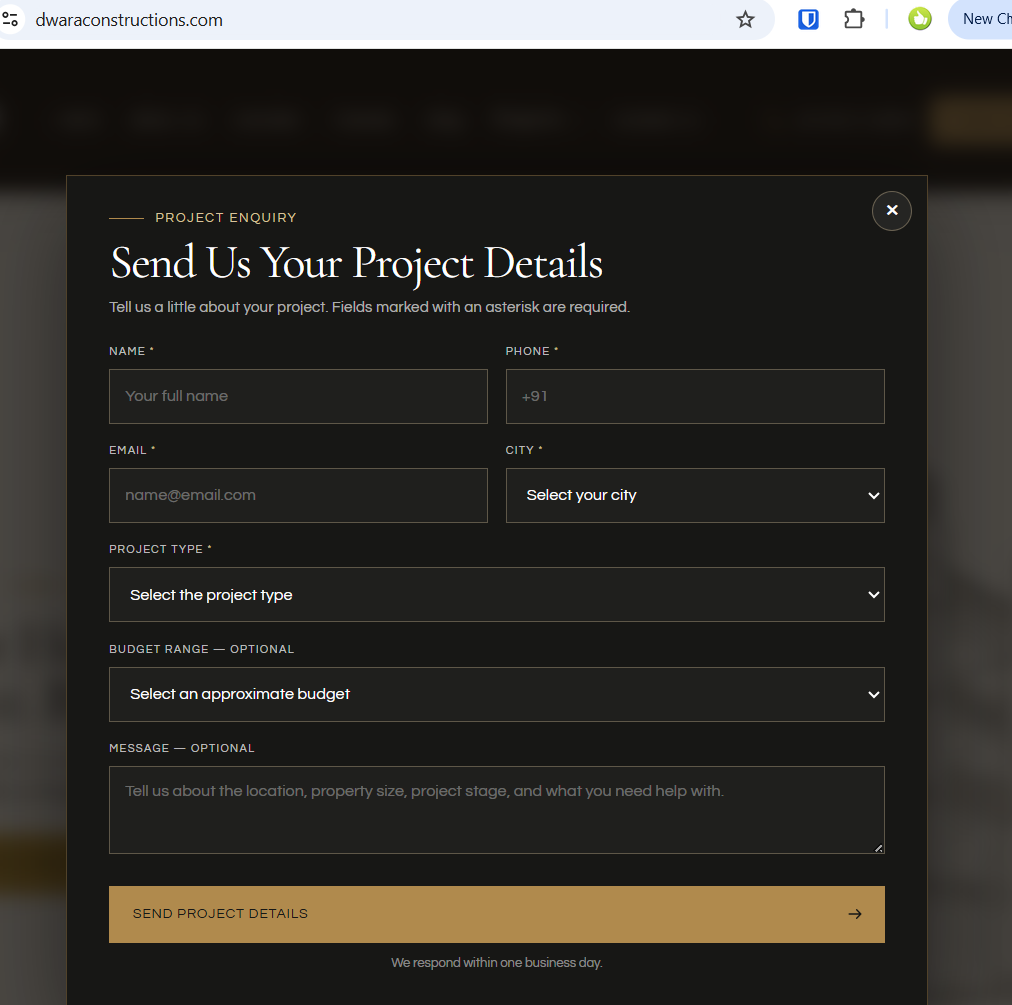
This is the opposite of invisible design. It’s obstructive design.
A fast, clean website that loads in under 3 seconds and lets you scroll smoothly through a photo gallery is more impressive than one that looks beautiful in a static screenshot but freezes when you try to use it.
What Dwara Construction Should Do Right Now
If you own a site like Dwara Construction’s, here are the immediate fixes needed:
- Remove the decorative animations — Those animated background lines need to go. Replace them with static CSS gradients or simple SVGs. Save the animation for actual user interactions, not passive decoration.
- Audit your animation libraries — Identify every animation framework running on your site (GSAP, Animate.css, AOS, custom JavaScript). Keep only those that serve a business purpose. Delete the rest.
- Test on real devices — Open your site on an iPhone with 4G speeds. If it freezes or lags, you have a problem. If it’s fast on desktop, assume it’s 3x slower on mobile.
- Run Google Lighthouse — This free tool will tell you exactly what’s wrong. Performance, Accessibility, Best Practices. Use it as your checklist.
- Enable GPU acceleration carefully — Use `will-change: transform` sparingly. Only on elements that absolutely need it. Not on every background decoration.
- Optimize the DOM — Every unnecessary element adds rendering cost. Clean up your HTML. Remove decorative divs. Use CSS instead where possible.
- Test the user flow — Have a construction prospect visit the site on their phone. Can they find your portfolio? Your contact info? Or are they bouncing before seeing any projects?
The question to ask your designer: “Will this animation work smoothly on an iPhone on 4G, and will it help visitors find what they need?” If the answer is anything other than “yes to both,” cut it.
How This Happens: The Designer Problem
I’d bet money on what happened with Dwara Construction:
They hired a designer (or design agency) who showed them beautiful mockups. The homepage animation was smooth in the presentation. The parallax effects looked elegant. The designer explained the “sophisticated” approach to visual storytelling. The client was impressed. They signed off.
What they didn’t do: test the site on an iPhone with 4G. Test it on a laptop from 2018. Have actual construction customers try to navigate it. Run it through Google Lighthouse. Watch real people scroll through it.
The designer gets paid either way. Their portfolio looks great on a 27-inch monitor in a quiet office. But here’s the truth: designers get hired based on portfolio websites, not based on how many leads their sites generate. So there’s an incentive structure that rewards beautiful over functional.
This isn’t malice. It’s just misaligned incentives. But for Dwara Construction, it’s costing them real money: every person who finds their flyer, visits the site, and bounces back without calling is a lost lead.
What Happened With Dwara Construction
They did several things right: the headline is compelling, the value proposition is clear (“One team, no handoffs”), the CTA button is visible, and their contact info is accessible. Those are solid fundamentals.
But then the animations took over. I couldn’t scroll past the first section. The browser froze. I couldn’t see their project portfolio. I couldn’t find their pricing or service details. I didn’t understand if they do new construction, renovations, or both. The visual design that was supposed to impress me actually blocked me from learning anything about their business.
Their flyer made me curious. Their website made me leave without any information. That’s not a design win. That’s a business loss.
The good news? This is fixable. They have the fundamentals in place. They have a clear message. They just need to remove the technical debt (the animations) and optimize for actual user behavior instead of design trends. A 2-week optimization sprint could turn this site from a barrier into a lead-generating machine.
The question is: will they notice the problem before their competitors do?
The Takeaway
Your website is a tool for growing your business. Every element should serve that purpose. Beautiful design matters—but only as much as it helps, not hinders, that goal. A clean, fast, mobile-friendly website that clearly explains your value and makes it easy to contact you will outperform a gorgeous one that’s difficult to navigate.
Stop trying to impress people. Start trying to help them. Your business will thank you.